Not the furniture. Not the smell. Something quieter. You felt it before you named it.
That was color psychology doing its job. And it has been doing it your entire life without asking permission.
1. Color Psychology Is Not a Design Trend. It Is 128 Years of Research.
The first peer-reviewed study linking color to emotion was published in 1895.
Since then, researchers have run the same basic experiment in hundreds of different configurations, across different countries, cultures, age groups, and languages. A 2025 review in Psychonomic Bulletin and Review pulled together 132 of those studies spanning that entire period.
The finding held across all of them.
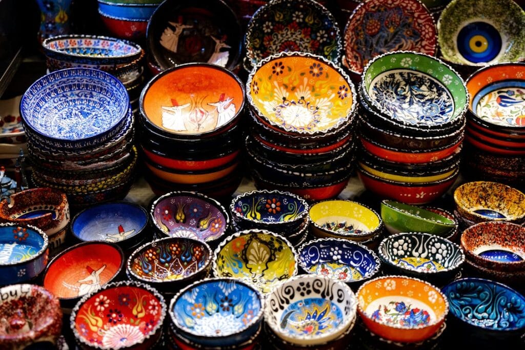
Humans systematically and reliably associate colors with emotions. Yellow with joy. Black with sadness. Light colors with positive emotion. Dark colors with negative emotion.
This is not interior design intuition. It is one of the most consistent findings in psychological research.
Your nervous system is reading the room before your brain catches up.
2. Blue Calms You Down. Red Speeds You up. the Research Is Specific About Why.
Blue and green had the most positive psychological impact across studies. Participants felt calm, focused, and comfortable. Red increased energy and alertness but often led to reduced concentration and mental fatigue over time.
The mechanism is physiological, not aesthetic.
Warm colors like red and orange activate the sympathetic nervous system. Heart rate rises slightly. Alertness increases. The body moves into a mild version of readiness.
Cool colors do the opposite. Blue in particular slows the physiological arousal response. A 2024 study from Pepperdine University confirmed that cool background colors were associated with higher accuracy on cognitive tasks and lower negative affect.
This is why operating theatres are often painted in cool greens and blues. Why fast food restaurants use red and yellow. Why spas do not paint their walls orange.
Nobody in those rooms is thinking about color psychology. It is working on them anyway.
3. the Effect Changes Completely Depending on Light
Color does not work in isolation.
In cool lighting, negative mood was higher in blue environments than in red ones. In warm lighting, the opposite held. The combinations of color and lighting interact in distinct ways that affect both mood and cognitive performance.
What this means practically: a blue room with cold overhead lighting can make you feel worse, not better. The same blue room with warm lighting produces calm.
Most people redecorate their walls without touching their lighting. The research suggests that is doing half the job.
The color is only part of the signal your brain is receiving. The light tells it what time of day it is, what kind of space this is, whether to relax or stay alert. Color and light together produce the effect. Neither one alone is the full story.
You cannot separate the color from the conditions it sits inside.
4. Color Psychology Shifts Across Cultures. Some of It Is Universal Anyway.
Here is where it gets complicated.
White signals purity and cleanliness in Western cultures. In parts of East Asia, it is the color of mourning. Red means luck and celebration in China. Danger and urgency in most of the West. Green means go in traffic systems. In some Middle Eastern contexts it carries deep religious significance.
These associations are real and they matter, especially in design, branding, and healthcare settings where the wrong color choice in the wrong cultural context produces the wrong response.
But underneath the cultural variation, the universal pattern holds. Lighter colors tend to enhance mood, reduce stress, and promote physiological calmness across racial groups. Darker colors are associated with anxiety and heightened physiological arousal, though context moderates their effects.
The cultural layer sits on top of a biological baseline. Both are operating at the same time.

5. You Can Use Color Psychology Deliberately. Most People Never Do.
The research suggests three things that are straightforward to apply.
If you work from home, the color of your workspace matters more than the color of your living room. A room you spend eight hours in doing focused work should probably not be red.
Lighting is not separate from color. Changing the warmth of your light source changes what your color does to you. This is cheaper and faster than repainting.
Saturation matters as much as hue. It is lighter colors specifically that reduce stress and promote calmness. A pale blue and a saturated electric blue are not doing the same thing. The research is about tone as much as color family.
None of this requires a complete redesign.
It requires paying attention to something your nervous system has been responding to your entire life, and deciding, for once, to respond back deliberately.
Read Next: Dharkot Village Sat Above the Clouds and Below the Noise.
For Most Men, the Question Is Never “How Do You Feel?”
Are You Outsourcing Your Thinking? Here Is What You Lose When You Do.
The Gym Was Not About My Body. It Was the Only Hour That Was Mine.